Visual makeover for
Van Wellen Group
Clear branding that expresses what your company stands for. Topped by a bright website fully loaded with specific information and an up-to-date project range for visitors. That’s what we created in association with property specialists Van Wellen Group.
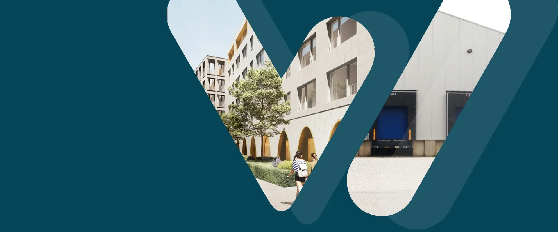
For three generations now, Van Wellen Group has been active in the development and management of commercial and residential property in and around Antwerp and on the coast. The family business wanted to clearly market its two specialisms in a modern and contemporary style.
Not an easy ask: the first of those specialisms is residential property, while the second is commercial storage for businesses in the port of Antwerp.
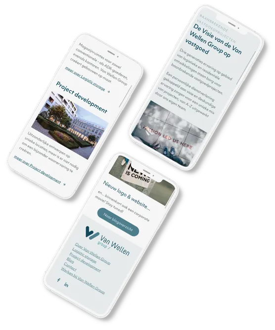


New website in new style
On the new website we tell the story in a clear, convenient structure. Visitors are able to access the latest information about the commercial property on offer, including plans, availability, pricing and floor space. The residential projects are presented separately with the focus on ambience and experience.
Clear, considered branding
Our creative unit got to work, designing not one but three logos. A main logo for the whole group and two secondary logos with colour accent of the Project Development and Logistic Storage departments.

